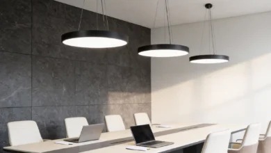
Window treatments do more than control light and privacy. They shape the emotional tone of a space through colour, texture, and visual weight. A thoughtfully chosen palette can calm, energize, or ground a room without changing furniture or layout. Many homeowners first encounter these effects when consulting a local blinds company and realizing how much mood can shift with a simple fabric or finish change. Understanding colour psychology in window treatments helps you design rooms that feel as good as they look.
How Colour Influences Perception in Interiors
Colour affects how we interpret size, temperature, brightness, and comfort. Lighter hues tend to expand perceived space and reflect more daylight. Darker tones add intimacy and visual stability. Warm colours such as reds and ochres can make rooms feel cozier, while cool colours like blues and greens promote calm and clarity. Because window coverings sit at eye level and often span large areas, their colour carries strong psychological impact.
Beyond hue, saturation and value also matter. Soft, muted tones feel restful and timeless. High saturation reads bold and expressive. Deep values convey sophistication and shelter. The right balance depends on the room’s purpose, light conditions, and existing finishes.
Choosing the Right Colour Family for Each Room
Different rooms support different emotional goals. Bedrooms prioritize relaxation. Living rooms balance comfort and sociability. Kitchens and workspaces benefit from alertness and focus. Matching colour families to function keeps spaces coherent and supportive of daily routines.
Bedrooms: Restful and Restorative
Soft blues, sage greens, lavender greys, and warm neutrals encourage relaxation. These hues lower visual stimulation and support wind down routines. Light filtering fabrics in these colours soften morning light, reducing glare while preserving brightness. Blackout options in the same palette deepen sleep without adding visual heaviness.
Living Rooms: Warmth and Connection
Living areas benefit from welcoming tones such as taupe, camel, terracotta, and muted gold. These colours feel grounded and social, complementing wood and leather. Layered window treatments in coordinating shades add depth without crowding the room. If the space receives strong daylight, slightly deeper tones prevent washout and maintain warmth.
Kitchens and Dining: Fresh and Inviting
Clean whites, pale greens, and sunlit yellows feel hygienic and uplifting. In dining zones, gentle warmth supports appetite and conversation. Easy care materials in these hues keep the space bright and practical. Subtle patterns can add interest without visual clutter.
See also: The Role of AI in Modern Home Styling
Home Offices: Focus and Clarity
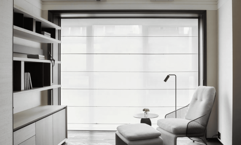
Cool neutrals, dusty blues, and olive greens reduce distraction and eye fatigue. These shades support concentration during screen work and reading. Adjustable blinds in matte finishes limit glare while maintaining a composed look. Avoid overly vivid colours that compete with task focus.
The Role of Light in Colour Perception
Daylight changes colour throughout the day. Morning light skews cool and blue. Afternoon light grows warmer. Artificial lighting adds another layer of shift. A fabric that appears serene in a showroom may look different at home. Window orientation also matters. North facing rooms receive cooler, even light. South facing rooms are bright and warm. East and west exposures bring directional shifts.
To manage these variables, test swatches in place at different times. Observe how the colour interacts with wall paint, flooring, and furnishings. Semi sheer materials amplify ambient light, making colours appear lighter. Opaque fabrics hold colour density and reduce transmission. Reflective backings on blinds can brighten rooms while preserving front facing colour.
Texture, Pattern, and Finish as Mood Modifiers
Colour does not act alone. Texture and finish influence how colour is perceived. Matte fabrics read soft and modern. Lustrous weaves feel formal and refined. Natural fibers such as linen or bamboo convey calm and authenticity. Smooth synthetics feel crisp and contemporary.
Pattern scale also shifts mood. Large scale motifs add drama and movement. Small repeats feel orderly and subtle. Tone on tone patterns provide interest without strong contrast, maintaining serenity. In minimalist rooms, textured neutrals prevent flatness. In maximalist settings, restrained textures keep colour from overwhelming.
Warm Versus Cool: Balancing Emotional Temperature
Rooms often need a balance of warm and cool to feel comfortable. If walls and floors lean cool, warm toned window treatments add welcome contrast. If the palette is already warm, cool toned blinds can refresh and lighten. This balance stabilizes the overall mood and prevents monotony.
A few practical guidelines help maintain equilibrium:
- Pair cool wall colours with warm neutral window fabrics for comfort
- Offset warm wood tones with cool grey or green treatments
- Use neutral hardware finishes to bridge warm and cool elements
These small adjustments keep spaces harmonious without major redesign.
Neutrals as Psychological Anchors
Neutrals are not absence of colour. They are anchors that stabilize visual flow. Whites, creams, greiges, and charcoals allow other elements to stand out while maintaining calm. In window treatments, neutrals provide flexibility as furnishings change over time. They also maximize light control without imposing strong emotional cues.
Undertone matters with neutrals. A grey with blue undertone feels cool and modern. A grey with brown undertone feels warm and classic. Matching undertones across walls, flooring, and window coverings prevents discord. When in doubt, select a neutral that echoes the dominant undertone in the room.
Bold Colours for Accent and Identity
Bold window treatments can define a room’s identity. Jewel tones like emerald, sapphire, and burgundy add depth and luxury. Sunny hues like coral or marigold bring energy and creativity. These choices suit feature windows or rooms meant to inspire, such as studios or reading nooks.
To keep bold colours balanced, control their proportion. Limit vivid treatments to one or two windows. Echo the colour in smaller accessories to create cohesion. Maintain neutral surroundings so the colour remains focal rather than overwhelming.
Cultural and Personal Associations
Colour meaning varies by culture and personal memory. Red can signal celebration or caution. White can represent purity or mourning. Blue may evoke sea, sky, or corporate formality. When selecting window treatment colours, consider the occupant’s background and experiences. A calming shade for one person may feel sterile to another.
Personalization strengthens emotional fit. Collect references of colours that feel comforting or energizing in real life settings. Compare them under home lighting. Align choices with lifestyle, not just trends. A room that resonates personally sustains satisfaction over time.
Seasonal Flexibility Through Layering
Layered window treatments allow seasonal mood shifts without full replacement. Sheers in light neutrals brighten spring and summer. Heavier drapes in deeper tones add coziness in cooler months. Blinds provide year round structure, while overlays adjust tone and insulation.
A simple layering approach can include:
- Neutral base blinds for light control
- Sheer panels for brightness and softness
- Seasonal drapes in deeper or warmer colours
This system supports comfort and visual change with minimal effort.
Small Spaces and Colour Strategy
In compact rooms, window treatment colour influences perceived size. Light hues reflect more light and open the space. Matching treatment colour to wall colour reduces contrast, making boundaries recede. Mounting treatments high and wide increases apparent window scale, enhancing spaciousness.
In narrow rooms, vertical stripe patterns elongate height. In low ceiling areas, avoid heavy dark headers that compress space. Consistent colour across multiple windows unifies the room, preventing visual fragmentation.
Open Plan Continuity
Open layouts require colour continuity across zones. Window treatments visible from multiple areas should coordinate with the broader palette. This does not mean identical colour everywhere. Instead, use a shared undertone or neutral family to connect spaces. For example, warm greige blinds can link a beige living area with a soft white dining zone.
If accent colours differ by zone, keep window treatments neutral to maintain flow. Alternatively, repeat a muted version of each zone’s accent in its local windows while preserving a consistent base neutral. This layered approach supports both unity and variety.
Sustainability and Emotional Wellbeing
Material choice affects mood beyond colour. Natural fibers often feel calmer and more grounded. Low gloss finishes reduce glare and visual stress. Breathable fabrics support indoor air comfort. Durable materials reduce replacement cycles, supporting long term satisfaction.
Sustainable window treatments also align with values, which contributes to emotional wellbeing. Knowing that materials are responsibly sourced or long lasting can deepen comfort in the space. Colour selections in earthy palettes often pair naturally with these materials, reinforcing a sense of connection to nature.
Practical Selection Process
Choosing colour for window treatments becomes easier with a clear method. Start with room function and desired mood. Assess existing colours and undertones. Evaluate light orientation and intensity. Test swatches in place. Consider texture and pattern scale. Confirm coordination across adjacent spaces.
A concise decision checklist:
- Define the room’s emotional goal
- Identify dominant undertones in finishes
- Note daylight direction and strength
- Test fabric or slat samples at home
- Balance warm and cool elements
This sequence prevents impulse choices and ensures coherence.
Common Mistakes to Avoid
Even appealing colours can misfire when context is ignored. Overly dark treatments in low light rooms can feel oppressive. Very bright whites in warm toned spaces can appear stark. Competing patterns across multiple windows can create visual noise. Ignoring undertones leads to subtle clashes that reduce harmony.
Scale also matters. A small window covered in a heavy dark fabric may look disproportionate. Conversely, a large window with a pale flimsy covering may feel underdressed. Match visual weight to window size and room scale for balanced impact.