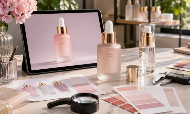
A skincare startup is preparing to launch its first facial serum. The creative team has approved the packaging: a frosted glass bottle in a muted rose color, a fine gold logo and a matching dropper.
The digital mockup looks convincing. The proportions seem balanced, the color complements the brand identity, and the product photographs beautifully.
Then the first physical sample arrives.
Under ordinary office lighting, the pink appears warmer than expected. The logo sits slightly too close to the bottle’s shoulder. The selected dropper makes the finished package taller, and the frosted surface changes how the contents show through the glass.
The sample is not necessarily defective. It may simply be revealing decisions that the rendering could never validate.
For beauty brands, this is where packaging development becomes more than a design exercise. Moving from a digital image to a commercially usable glass package requires several different approvals, each addressing a different kind of risk.
The most important question is not whether the mockup looks realistic. It is what the mockup has actually proved—and what remains untested.
1. Four Approvals That Beauty Brands Often Confuse
A polished packaging presentation can create a false sense of completion. Yet four documents or samples that look similar in a project meeting may serve very different purposes.
A digital mockup communicates the intended appearance. It helps teams compare bottle silhouettes, colors, logos and overall visual identity. It does not establish exact dimensions, material behavior or physical color accuracy.
A technical drawing defines measurable details such as capacity, dimensions, neck finish and selected component interfaces. It establishes a structural reference, but it does not reproduce the complete visual or functional experience.
A decorated physical sample allows the team to inspect the real glass, surface finish, printing and assembled appearance. Its value depends on whether the sample uses the specified materials and representative processes.
A production reference connects the approved appearance and structure to an agreed manufacturing specification, inspection method and acceptable variation. It provides a basis for reviewing production rather than simply remembering what an attractive sample looked like.
Approving one stage should not be mistaken for approving the others.
A founder may approve the soft pink visible in a rendering while the engineer is still reviewing the neck specification. Both approvals can be reasonable, but they address entirely different questions.
A clear project should identify which decision is being approved, by whom and against what evidence.
2. Why Glass Does Not Behave Like a Digital Surface
Color Is a Property of the Entire Package
In a rendering, a designer can apply a uniform color to a bottle and control every reflection. Real glass interacts with light in more complicated ways.
The visible result may depend on the base glass, its geometry, the coating, the presence of a frosted finish and the surrounding light.
Take the hypothetical rose-colored serum bottle. A pale coating over clear glass might look different near the thick base than it does across the central body. When the bottle is filled, the appearance may shift again because the contents and background influence what the viewer sees.
This is why the same digital color value should not be assumed to produce an identical appearance across a serum bottle, lotion bottle and cream jar.
For color-critical packaging, brands should agree on a physical target and review actual decorated samples under consistent lighting conditions.
A Pantone reference or digital color specification can guide development, but the approved physical appearance must be established separately.
Frosting Is Not Merely a Matte Filter
A mockup can simulate frosting by reducing gloss and adding a translucent texture. Physical frosting affects the way light interacts with the glass surface.
The result can influence perceived opacity, the visibility of the contents and the contrast of printed graphics.
For a brand combining frosting with colored coating or metallic decoration, the order and suitability of the selected processes matter.
A rendering can suggest the desired effect. Only a relevant physical sample can show how the chosen decoration looks on the selected bottle.
3. A Logo That Fits on Screen May Not Fit the Bottle
Artwork introduces a different set of challenges.
A logo placed on a flat digital image may appear perfectly centered even when the actual container has a curved body, tapered shoulder or limited printable area.
Consider a cylindrical serum bottle with a long brand name.
If the lettering extends too far around the curve, part of the name becomes difficult to see from the front. On a small bottle, the problem can become more noticeable because the available decoration area is limited.
A decorative cap may also change the perceived position of the logo once the package is assembled.
Brands should therefore request the usable decoration area for the specific bottle rather than scaling artwork directly from a marketing mockup.
Before confirming printing, review the artwork at actual size and check the position relative to the bottle shoulder, base and closure.
For fine lettering or metallic details, a decorated sample should be inspected from normal viewing distances, not only in enlarged photographs.
Another common mistake is treating every metallic-looking effect as equivalent. Metallic ink, hot-stamped foil and a decorative metal component are different solutions. They may not be suitable for the same surfaces or produce identical results.
A good artwork approval identifies the intended process as well as the desired appearance.
4. The Bottle Can Be Correct While the Complete Package Is Wrong
Glass packaging is rarely just glass.
A serum product may include a bottle, dropper pipette, bulb, collar and cap. A lotion package may use a pump and dip tube. A cream jar requires its own closure arrangement.
These components affect both appearance and operation.
In the hypothetical serum project, the approved rendering shows a short gold collar. The actual selected dropper has a taller collar, changing the bottle’s proportions and the space between the logo and cap.
The bottle itself may match the drawing perfectly, yet the assembled package no longer matches the intended design.
This is why component confirmation should happen before final visual approval.
Buyers need to verify the exact bottle neck, selected closure, relevant dimensions and assembly requirements. Similar-looking pumps or droppers should not be assumed interchangeable.
Functionality also requires separate checks.
A dropper must be evaluated with the intended serum. A pump should be reviewed for dispensing behavior. Closure fit and leakage performance should be assessed under appropriate conditions.
A visually convincing mockup cannot establish formula compatibility, dispensing consistency or shipping reliability.
5. Where FOLOVER PACK Fits Into the Process
For beauty brands developing glass packaging, an important supplier capability is the ability to coordinate the container, decoration and related components as one project.
FOLOVER PACK supplies cosmetic glass packaging for serums, lotions, toners, creams, perfumes and essential oils. Its product offering also includes relevant droppers, pumps, sprayers and caps.
This range is useful when a project moves beyond a single digital bottle image and requires decisions about the complete commercial package.
Start With the Actual Bottle Structure
FOLOVER PACK offers existing bottle and jar families in different shapes and capacities.
For a brand with an approved visual concept, selecting an existing structure can provide a physical starting point for checking the glass dimensions, neck specification and available decoration area.
When the intended silhouette is not available among existing options, the project may instead require custom glass development.
These are separate routes. Decorating an established glass bottle is not the same as developing a new mold.
Making that distinction early helps the team understand which aspects of the design can be refined through finishing and which may require structural development.
Translate the Design Into a Real Glass Finish
FOLOVER PACK’s glass bottle decoration and finishing services include spray coating, frosting, screen printing, hot stamping, colored glass options and applied branding.
These are not interchangeable visual filters. Each method serves a different purpose and must be reviewed against the selected bottle surface and artwork.
For example, a brand seeking a translucent pink bottle may need to evaluate both the intended color and the degree of translucency. A gold logo may require a specific decoration method, artwork adjustment and a physical review of its position.
FOLOVER PACK’s published guidance emphasizes the importance of physical samples for confirming color and decorative appearance. It also notes that flat or curved areas, shoulder transitions and available decoration space can affect the feasibility of a design.
That is directly relevant to brands whose mockups use simplified or idealized bottle surfaces.
Review the Assembly, Not Just the Decoration
FOLOVER PACK also describes a workflow that includes defining packaging requirements, selecting bottles, matching related components, confirming decoration and samples, and preparing production and inspection.
For a brand developing a serum bottle, that provides a practical framework for reviewing the dropper and collar alongside the decorated glass.
For a broader skincare collection, it can help buyers discuss how different containers and finishes should relate visually while allowing each product to use an appropriate dispensing system.
The benefit is not a promise that every decoration or component will work on every bottle.
Exact compatibility, appearance, sampling conditions, commercial terms and performance requirements still need project-specific confirmation.
Rather, FOLOVER PACK’s combination of glass packaging, finishing options and related components gives buyers a structured starting point for converting visual concepts into specifications that can be reviewed physically.
6. Build an Approval Process That Can Actually Catch Problems
The most effective way to reduce surprises is not to request endless samples. It is to define what each review must establish.
For a new glass serum bottle, the project might follow this sequence:
| Approval stage | Main question | Evidence to review |
| Concept | Does the design express the brand identity? | Digital mockup and references |
| Structure | Is the selected bottle geometry appropriate? | Dimensioned drawing and physical container |
| Components | Do the intended dropper, pump or cap fit the design? | Specified assembled sample |
| Decoration | Do the color, finish and logo meet the agreed appearance? | Decorated physical sample |
| Functional review | Does the complete package work with the intended formula? | Appropriate compatibility, dispensing and sealing evaluations |
| Production approval | What standard will the production batch be checked against? | Approved reference, specification and inspection criteria |
Each stage should have a defined reviewer and a clear record of the decision.
A phrase such as “sample approved” is not enough if nobody knows whether the approval covered color, dimensions, decoration or performance.
For example, a brand may approve the appearance of a frosted bottle while leaving formula compatibility pending. That limitation should be recorded explicitly.
The same applies when the approved sample is not fully representative of commercial production. The buyer should ask which materials, processes or components differ, and what additional review is needed.
7. The Last Risk: An Approved Sample Is Not the Same as Every Production Unit
Receiving a beautiful decorated sample is a milestone, not the end of quality planning.
Commercial production introduces another challenge: repeatability.
The buyer and supplier should agree on a reference for color, print position, surface appearance and other relevant features, alongside the applicable dimensional and functional requirements.
Where variations are expected, the acceptable limits and inspection approach should be defined rather than decided after the goods arrive.
For example, if a brand uses several bottle capacities with the same rose-colored finish, it should not automatically assume that one approved sample represents every size and shape.
The relevant versions may need separate approval or a documented approach to judging consistency across the collection.
Artwork version control is equally important. If the logo moves or the cap changes after the sample is approved, the affected appearance and assembly decisions should be reviewed again.
A retained master sample, approved files and a clear inspection specification give both sides a more useful basis for discussion than screenshots shared across email threads.
Conclusion
Digital mockups help beauty brands imagine what a product could become. They are valuable for creativity, communication and early design decisions.
But they cannot independently establish the final color of coated glass, the appearance of printing on a curved surface, the proportions of a real dropper assembly or the performance of a filled package.
Those questions need different evidence.
A stronger development process connects the visual concept to an actual glass structure, a defined decoration method, a complete component configuration and an approved physical reference.
The goal is not to make every physical bottle look exactly like a computer rendering under all conditions.
It is to make sure the brand knows what it is approving—and that the final packaging is judged against a clear, realistic and agreed standard.